

35 Examples of the Worst Website Designs in 2026, along with an analysis of what went wrong for them
A visually striking website encourages users to look around, enjoy reading the content, and take action. It could be anything from purchasing a specific product to signing up for your newsletter, but your creativity is never wasted. By picking the wrong website designs, you not only risk your credibility but also end up losing visitors.
Have you ever arrived at a bad website and wished you hadn’t? Or did visiting a website confuse you to the point where you forgot what you were looking for? If you did, you would appreciate this article even more. We have not only cited examples of the 50 worst website designs, but we have also added an in-depth analysis that will assist you in gathering actionable insights.
Before we begin, let us first understand the signs of a bad website that you can work on to improve your website’s engagement metrics.
5 Signs of a Bad Website
Check the list below to see if your website requires an overhaul. To assist you in identifying problem areas on your website, we have outlined the 5 signs of a bad website.
- Slow Website Speed: The time it takes for pages to load on your website is used to determine its speed. If your website takes too long to load, you will have a high bounce rate and a low ranking on SERPs. Luckily, it’s not something you cannot improve upon.
- Information Overload: If you overload your website with too much information, your website may look cluttered and difficult to navigate for visitors. Information should be crisp and to the point so that it doesn’t confuse the user about what action to take next.
- Insufficient Whitespaces: Whitespaces are frequently dismissed by web designers as wasting space. But this should not be the case. Whitespaces are used to purposely break thoughts, allowing the user to better digest your content.
- Unclear User Journey: Always consider the visitor’s point of view when designing each page of your website. Remember that the goal of each page is to educate the visitor about the services or products you offer. Your website should direct the user to the “next” step. Your visitors easily convert into potential leads if you give them clarity in mind.
- Design not Mobile Friendly: If your website is not mobile responsive, the content is either too small to read, the images fall off the page, or the navigation is likely hidden. When mobile phones account for more than half of all web traffic, you cannot afford to ignore this area because it will have a significant impact on your Google rankings.
List of 35 Worst Website Designs with a detailed analysis of what went wrong for them
Problems:- Bad Fonts, No visuals, Confusing, Cluttered Text

If you have high hopes for Berkshire Hathaway, a company owned by world-famous investor Warren Buffet, you will be disappointed. This website, contrary to our expectations, is incredibly uninteresting, with no images/graphics/content to pique the attention of visitors. If you know who owns this website, you will be surprised.
2. Arngren.net
Problems:– No white spaces, Bad visuals, Cluttered text
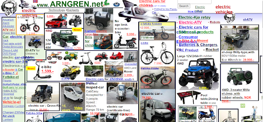
This website is extremely confusing to look at due to the congested text. This website ranks high on the list of worst website designs because it lacks proper navigation and white space, as well as bad color and poor visuals. The website is not only outdated but also non-responsive to mobile devices; such websites should be avoided at all costs.
Problems:- Unclickable Buttons, Slow Site speed, Poor site navigation
This website is very simple and basic, but it has made it to the list of the worst website designs due to its full-width layout, poor quality repeated images, use of different text alignments, off-center text, and other factors. This website suffers primarily from slow loading times caused by low-quality visuals, a bad font, and a color scheme that fails to charm visitors.
Problems:- Slow Website speed, Not mobile responsive
This website appears quite impressive upon a first quick look, with the menus displayed on the main page and the contact information in the footer. Only a closer examination of the website reveals the flaws. On the main page, there is a flashy video that takes up the majority of the space and contains no meaningful message. With such a long loading time, it appears that viewing this website on mobile is nigh on impossible.
Problems:- Poor Navigation, Bad visuals, Cluttered Text

The tried-and-true method for determining the efficiency of a website is seamless navigation, which informs the user of the actions required to reach the desired destination. Not only should the navigation be appealing, but it should also be prominently displayed at the top of the home page. The unusual animation designs used in this website make the visitor more confused about “where next”.
Problems:- Poor Design, Lacklustre
This would undoubtedly be one of your worst experiences with any market segment website. It looks more like a poorly written document, and visitors don’t know what the company sells. There isn’t a single product image to be found, and only the word stuffing makes it look more like a storeroom.
7: eBay
Problems:– Complex product pages with information overloaded
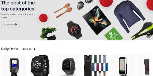
When you visit this online marketplace, you will be given complete product details such as the name, price, stock remaining, number of items already sold, shipping, payment, and even return information. The visitor is inundated with information, making it difficult to make intelligent decisions.
8: Wayfair
Problem:- Lack of visual Hierarchy
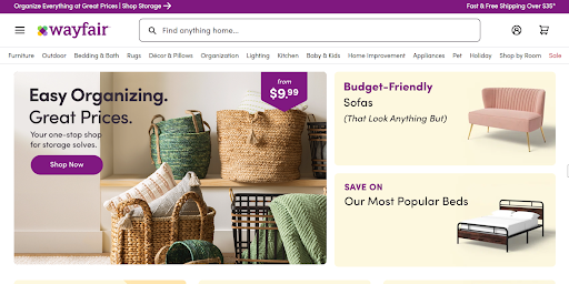
This website provides you with a wealth of information that may appear overwhelming, but it leaves you paralyzed with indecision about what to do next. This void is caused by a lack of visual hierarchy. The elements of the website are organized visually so that the visitor naturally drifts towards the crucial pieces, allowing the visitor to complete the desired action.
9: Pacific Northwest X-Ray Clinic
Problem:- Incorrect color usage, cheap clip-art animated logo
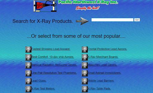
When you visit this website, you will almost certainly have a bad experience because it lacks good navigation, visuals, and an appealing color scheme. Furthermore, this antiquated website has unclickable buttons, spacing issues, slow speed, cluttered text, bad fonts/typography, and is not at all mobile responsive, leaving the visitor befuddled.
10: Suzane Collins
Problem:- Broken Links, Cluttered Text, No White Space, Bad color scheme, Not mobile responsive, Unclickable buttons

If you are visiting the first author’s website, you will find nothing wrong with it. If, on the other hand, you enjoy reading the websites of famous authors, you will find this website to be quite simple and monotonous. This website’s colors and layout could use some improvement. Even the author’s picture on the website is ambiguous. To be appealing to visitors, the website must improve its design and make it more exciting.
11. Craigslist
Problem:- Not Eye-appealing, Cluttered Text, No visuals
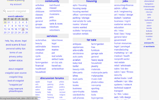
It may surprise you to learn that Craigslist is one of the most popular websites in the world. However, there are no appealing images, logos, or banners on the website. It is simply a collection of links that users can use to obtain the location-based information needed to complete various tasks. Its success can be attributed to its usability, but its link-based structure is hugely annoying for users.
12. Blinkee
Problem:- Not responsive website and flashy animations
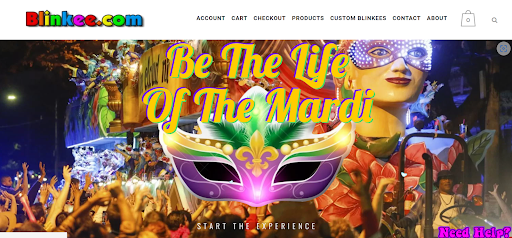
Blinkee still uses window-specific scrolling, as did websites in the 1990s. The user’s senses may be overwhelmed by a large number of animated GIFs, constantly changing flashy images and a massive amount of blank space. The use of too much color reduces the user’s visibility and accessibility.
13. Zara
Problem:- Unusual Navigation and No CTA
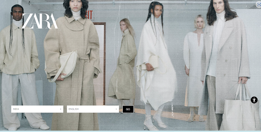
This visually appealing website transports you back to the days when you used to enjoy reading an editorial magazine. However, it fails miserably in its primary goal of lead conversion. Because shopping on this website is challenging. This website lacks any explicit CTA, instead leaving them confused and frustrated with small text and menus hidden behind a hamburger button.
Problem:- Too large font/ Typography, No images to make it look interesting

Because of its bad fonts/typography, poor visuals, confusing navigation, and broken links, this website makes a list of bad website designs. This website looks outdated and is non-responsive to mobile view. With unusually large fonts and no appealing visuals, you’re bound to lose interest quickly.
15: 4Chan
Problem:- No visuals, Cluttered Text, No white spaces
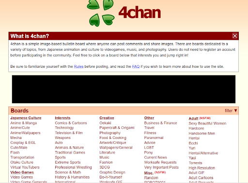
This English image board website is repulsive and lacks luster. With only text and no animation or images, the content appears flat. This appears to be white pages rather than a website, with no images or indication of where to go next. You feel as if you’ve been thrown into a maze of links to various pages, with no idea where to begin.
16: Where2eat
Problems:- Poor structure, Bad Font, Confusing
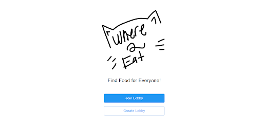
When you visit the website, you will notice two options: “Join Lobby” and “Create Lobby,” in contrast to your expectations of a well-structured menu on the home page. When you select one of the options, you are not taken to the home page; instead, you must go through several stages of screening before arriving at your destination, where you can select your favorite food items. This website, which recommends restaurants based on your location, deserves a more appealing design and easier navigation. You believe the website’s navigation and structure are in desperate need of improvement.
17: Sparkella
Problems:– No accuracy, poor color scheme, No headers
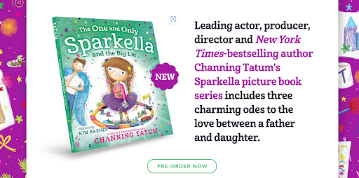
This website is dedicated to the picture book debut of Channing Tantum, the leading actor, producer, and director. This story is based on Kim Barnes’ captivating homage to the love between a father and a daughter. The website lacks clarity in terms of menus, despite having excellent art and illustrations. If this website is spiced up with a few stylish flourishes, it will be much more appealing to visitors.
18: Penny Juice
Problem:- Bad Fonts, Outdated/bad color scheme, Not mobile responsive

When you visit the website, you are bombarded with a plethora of colors. This will scare you as much as any recent blockbuster horror film. When the overuse of colors is combined with poor font selection, this website becomes a complete flop. If the color schemes used on the website are inspired by fruit colors, they have failed miserably. As a result, the overabundance of colors makes the website appear filthy and cheap.
Problem:-Bad color scheme, Cluttered Text, Bad visuals

In this fast-paced digital competition, if your website is visually appealing and captivating to visitors, you will undoubtedly win the race. This website exemplifies poor design and background color schemes. This website appears antiquated and does not meet the expectations of modern-day visitors who value aesthetics as much as product quality when making an online purchase.
Problem:- Poor Navigation, Small fonts, Slow website speed, spacing issues, Not mobile responsive
This website is very confusing and uninteresting. It’s incredible that this website, which deals with colors professionally, chose such a bright color scheme for its background, namely Blue and Black. The sidebar navigation is confusing, and the website takes too long to load. The fonts used are so small that a magnifying glass is required to read them (pun intended).
21: The World’s worst website ever
Problem:- Bad Navigation, Outdated, Cluttered Text, Unclickable buttons, Spacing issues, Poor visuals
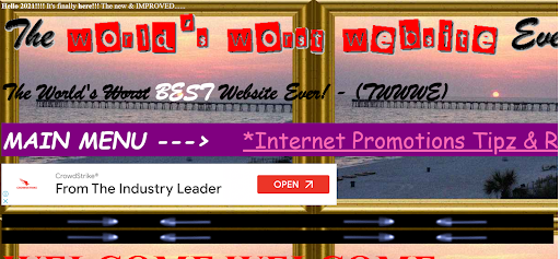
This website is intended to give visitors a true sense of what the worst website design looks like. The origins of this website, on the other hand, require closer examination. When it comes to flaws in this website, there is nothing you can overlook, from the bad font to the poor color scheme to the cluttered text and slow website speed.
Problem:- Too flashy, Bad Fonts, Cluttered Text
When you visit this website, you feel as if you’ve been transported to the worlds of Star Wars or Star Trek. This supercharged website was designed by a die-hard Star Wars fan. The text used in the menu buttons is too small; you must focus on each letter to read it. There are numerous reasons for this website’s inclusion on the list of worst website designs, ranging from the small font size to the distracting color scheme.
23: The Room Movie
Problems:- Poor website design, Cluttered Text, Bad Fonts

This is one of the weirdest websites on the list of worst website designs. This official movie website looks completely uninteresting with poor spacing and use of bad typography. This website is not mobile-responsive and has an extremely bland color scheme and visuals.
24: Budgets are sexy
Problems:- Monotonous, Not appealing
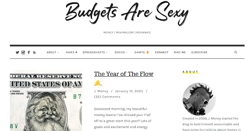
This personal finance website contains useful information but lacks responsive templates and convincing designs. The entire page is crowded, and the content is poorly organized to keep the reader interested in the website. It appears to be more of an educational magazine than an engaging website.
25: Lings Cars
Problem:- Too many elements cluttering the page
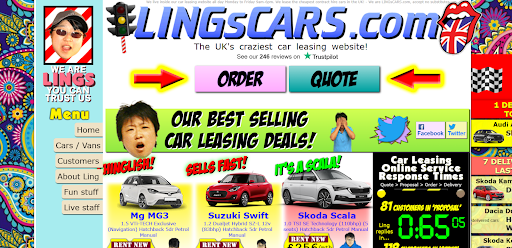
Text, pop-up ads, dozens of animated elements above the fold, auto-loading videos, and other elements make this used-car website difficult to navigate. These distractions cause visitors to abandon the website before it has served its purpose.
26: Begley Living
Problem:- Lacks good design and well-structured layout
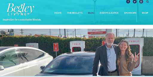
Due to its outdated design and poor color scheme, this website of American actor Ed Begley Jr ranks among the worst website designs. This website fails to capture and hold the attention of visitors because the content on different pages is not well organized.
27: CyberDsignClan
Problem:- Bad visuals, Confusing, Slow website speed

This slowly crawling website with bizarre fonts irritates both your eyes and your mind. When you visit this website, all you see is “Skip Intro” written in large graphics, with no clear message about how to proceed. When you click on this, the home page loads, leaving the visitor mystified and infuriated.
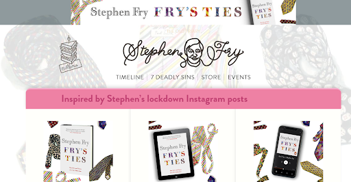
Problem:- Bad color scheme, Unclear Website Structure
Anyone who visits this well-known Stephen Fry website is easily distracted by the dull color scheme, ambiguous website structure, and plethora of confusing distracting elements that lack cohesiveness.
Problem:- Poor Navigation and Images too Large
When you visit this website, it appears that the designers intended it to be a powerful example of a harrowing website. This website’s navigation and image optimization are both lacking. This unappealing website with inconvenient fonts, underlined texts, and banners everywhere would take you seconds to leave.
30. Theweddinglens
Problem:- Design not Responsive
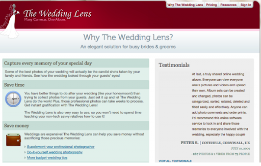
This website does not have a mobile version and loads the entire page on your mobile device. When your website is not mobile responsive and has a poor plaintext interface, you may feel tempted to abandon it, as I did.
31. Nmg Group
Problem:- Unclear interface image background

The design of this website is quite good, but the real issue becomes apparent only upon closer inspection. The use of complex colors, styles, and textures overwhelms the text and background images. As a result, you discover that the entire interface is broken.
Problems:- Outdated design, No visuals/images
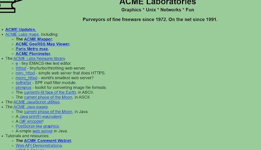
The company is a pharmaceutical company that has been in operation since 1972, but it does not appear to be a niche. Because of its primitive design and lackluster color scheme, the website appears to be out of date and loses a competitive edge. The green background is too dull, and the logo is also too cliche to entice users to stay on this website for an extended time. Even the text is cluttered and too small, creating an overall confusing appearance.
33. Yale University School of Art
Problems:- Outdated, Slow website speed, Poor visuals, Unclickable buttons, Bad navigation
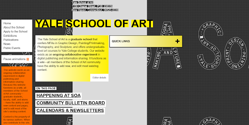
This website tops the list of the worst website designs because of its poor color scheme, bland aesthetics, and poor navigation. Graphic design, painting, photography, and sculpture are all available as undergraduate and graduate degrees at Yale School of Art. However, this website fails miserably in conveying its mission to visitors. In terms of design, visuals, and aesthetics, the website lags behind other websites in the niche, which are critical to the performance of any website in this niche.
34: Dollar Tree
Problems:- Too many words for each product showcased, Unclear layout

Dollar Tree is a popular American retailer of low-cost merchandise. You expect the products on any e-commerce website to be displayed in a clear and well-designed layout. This, however, is not the case with this website. It has a wide range of products, but the product descriptions are too long, giving the overall impression of clumsiness. The visuals are appealing, but improving the structure of the website can significantly increase its appeal.
35: Water on Wheels
Problems:- Poor image quality
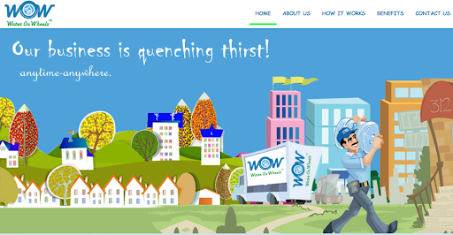
We all appreciate websites with shards and high-resolution images. Water on Wheels is a major provider of safe drinking water in Bangalore. This website has a nice color scheme, but all of the images are blurry, awkward, or warped, and lack sharpness. The blue background supports the water connection, but the poor image quality is disappointing and annoying to visitors.
Website Design Improvement Tips To Avoid Being Included Among the Worst Website Designs
Make your website mobile-friendly and responsive:
The terms mobile-friendly and mobile responsive are frequently used interchangeably. However, the meanings of the two terms are not the same.
- When your website is mobile-friendly, it can be accessed from any mobile device, tablet, or phone.
- When your website is responsive, it responds quickly to changes in screen size, browser preference, and display.
Easy Navigation
By following these few basic steps, you can considerably increase the organic traffic of your website-
- Limit the items in the main menu to seven.
- Users should be able to reach any part of the site from any other part of the site in three clicks or less. However, it is preferable to aim for two clicks.
- Labels and links should be as descriptive as possible.
- Keep your navigation bar in place.
Improve Page Speed
You can improve your page speed by enabling caching and image optimization. When you visit a website, it saves certain cache elements, allowing the website to load much faster when you come back. You can significantly reduce loading time for return visitors by enabling caching.
Oversized or poor-resolution images can considerably affect your site loading speed. So, before loading the image on your website, reduce the file size of the image without sacrificing the quality of the images.
Use Color Schemes to your Advantage
Your website’s lead conversion is heavily reliant on how well you optimize your content using color theory and psychology. Here are a few examples to demonstrate the importance of color theory-
- Red represents Love, Passion, Anger, Confidence
- Blue represents water, serenity, trust, and power.
- Green represents nature, fertility, balance, and cleanliness.
- White represents peace, balance, purity, simplicity, and winter.
Use Whitespaces to your advantage
- Whitespaces, also known as “negative spaces,” are important design elements that allow you to break up a page and improve readability. Without white space, the text and design on your website may overlap, making it look cluttered and confusing.
- As a result, it is always advisable to review the website pages to strip the content and design to create new whitespaces that make the website look enticing to visitors.
Key Takeaways
In this article, we’ve gone over the top 35 worst website designs and what flaws they have. Don’t get bogged down if your website is cursed by any of the problems listed above. We’ve also shown you how to change the game to your advantage by making minor changes to elements such as color, whitespace, page speed, navigation, and mobile-friendliness and responsiveness.
I hope you found this article useful and enjoyable to read!